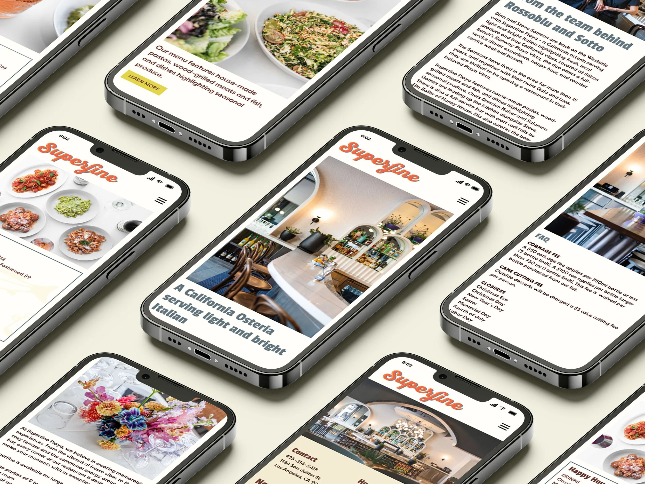
Mobile redesign for upscale restaurant
Superfine
Role
UX + UI Designer, Visual Identity
Team
Solo Design
Tools
Figma, Photoshop
Skills
Research, Visual Identity
4 weeks - 2 research + 2 design
Timeline
Industry
Hospitality
This project was completed as a redesign exercise drawing from a real business
Context
People looking where to dine out are increasingly likely to use mobile devices. In a city like Los Angeles, there are thousands of options for where to dine out. The mobile restaurant site experience has a huge influence on where people will book reservations, order takeout, or delivery. Because of the overcrowded market, restaurant sites must be easy to navigate, highly informative, and visually delightful. If it is difficult to view a menu, make a reservation, or find basic information about the restaurant, users will go elsewhere.
Context
Superfine Playa is an upscale Italian + Californian Osteria with a laid back and elevated dining experience. They are newly opened (June 2023) and hoping to attract new customers and retain current regulars.
About
Problem
Pop Ups
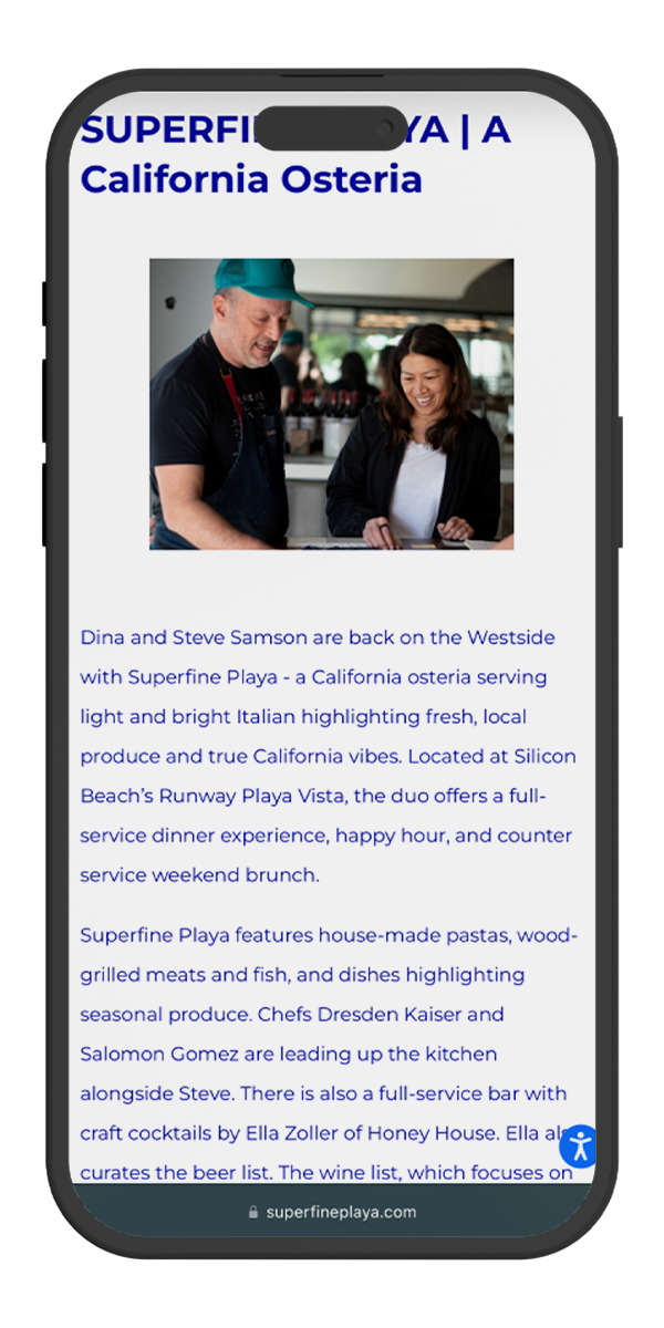
The original mobile site contained several pop ups, some which appeared on every page. This is highly frustrating to users who must navigate the unwanted information.
The original mobile site contained lots of information front and center that wasn’t high priority - such as house accounts, events, and virtual tours of the restaurant. If the user can’t find the info they need quickly - they leave the site.
Information Hierarchy
Inconsistent themes, boring type, and inconsistent layout made the visual experience less than optimal. Users cited branding as a huge contributor to where they choose to dine.
Bad Visual identity
How might we increase restaurant sales?
Objective:
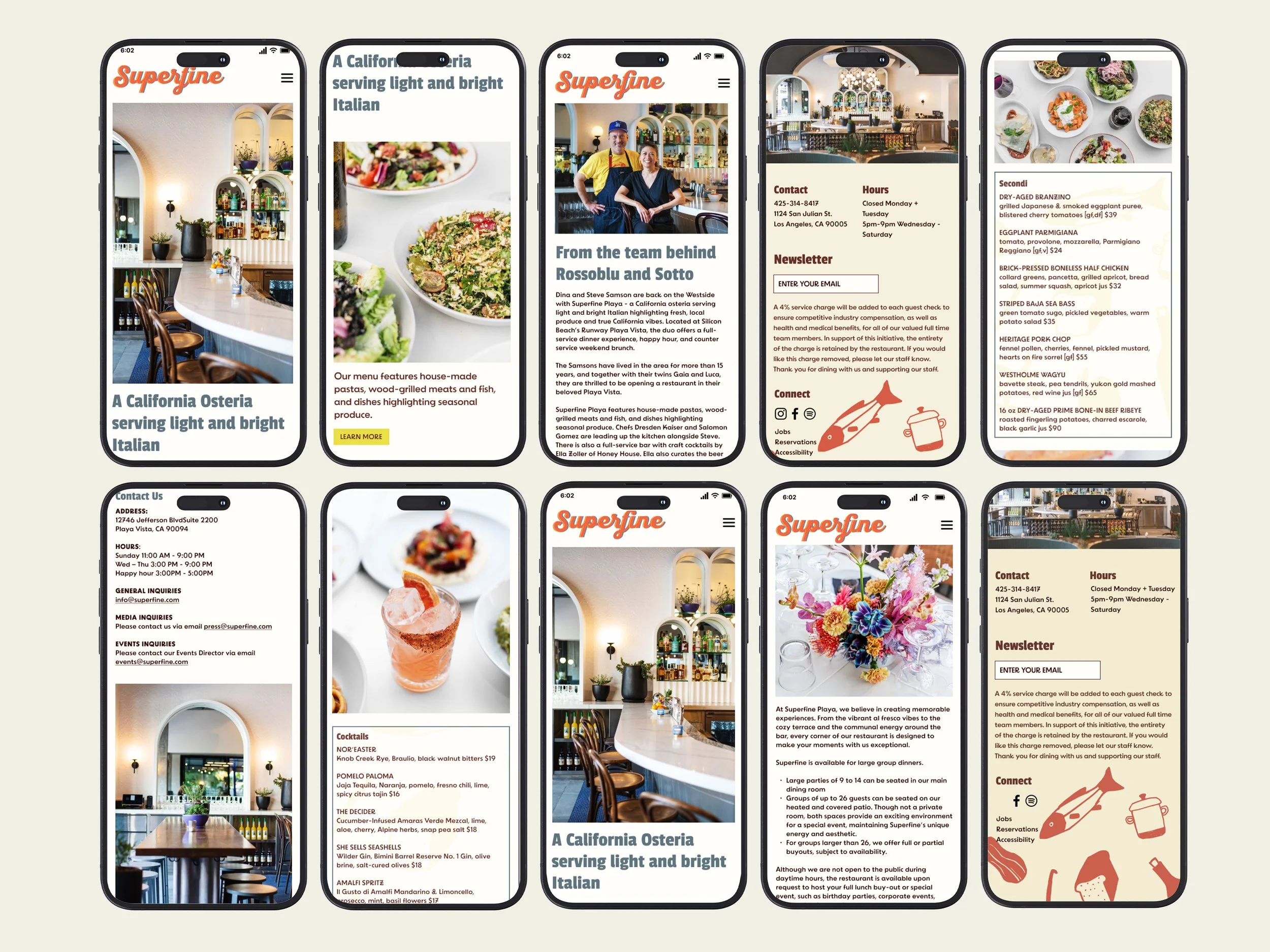
Key Screens
Redesign Highlights
Removing Popups
The majority of users interviewed stated popups were the most distracting, frustrating, and provided the most difficulty when navigating mobile sites.
Instead of having important information pop up on every screen, we streamlined what people look for the most to be the most accessible including making reservations, menus, and contact info.
Original
Redesign
Layout + Spacing in Food Menu
- Put all menus on one page instead go having five different pages for Happy Hour, Dinner, Dessert, etc
- Incorporated images as break from text and entice dinners
- Created visual structure with outlines and clean line breaks
Original
Redesign
- Shortened the main navigation menu to the most visited pages.
- Increased the space between links to make navigation easier
- Ensured easy exit from main menu
Content Priority In Nav Menu
Original
Redesign
- Streamlined themes throughout site - light background + dark type to create consistency
- Shifted to left alignment on all pages
Layout + Theme
Original
Redesign
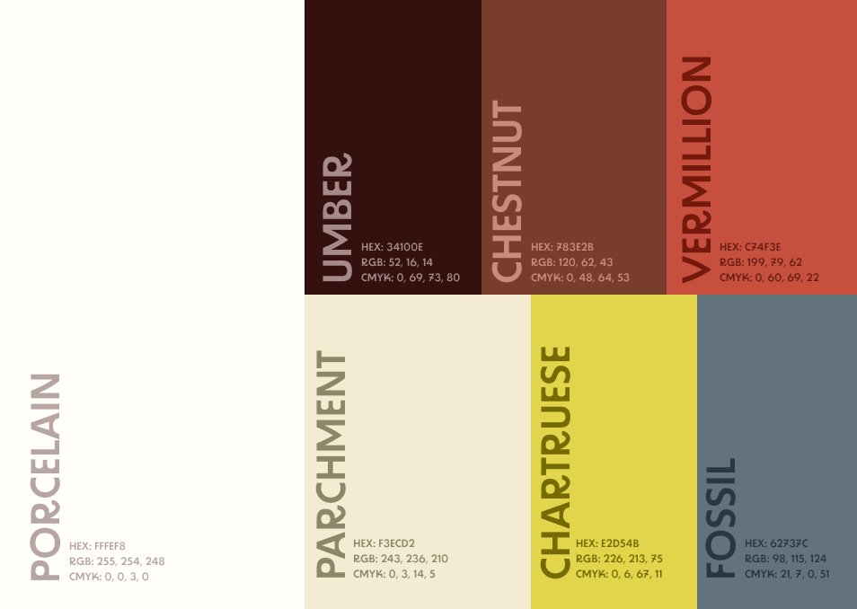
- Revamped color palette to fit the brand goals
- Focused on typography that felt warmer and with more personality
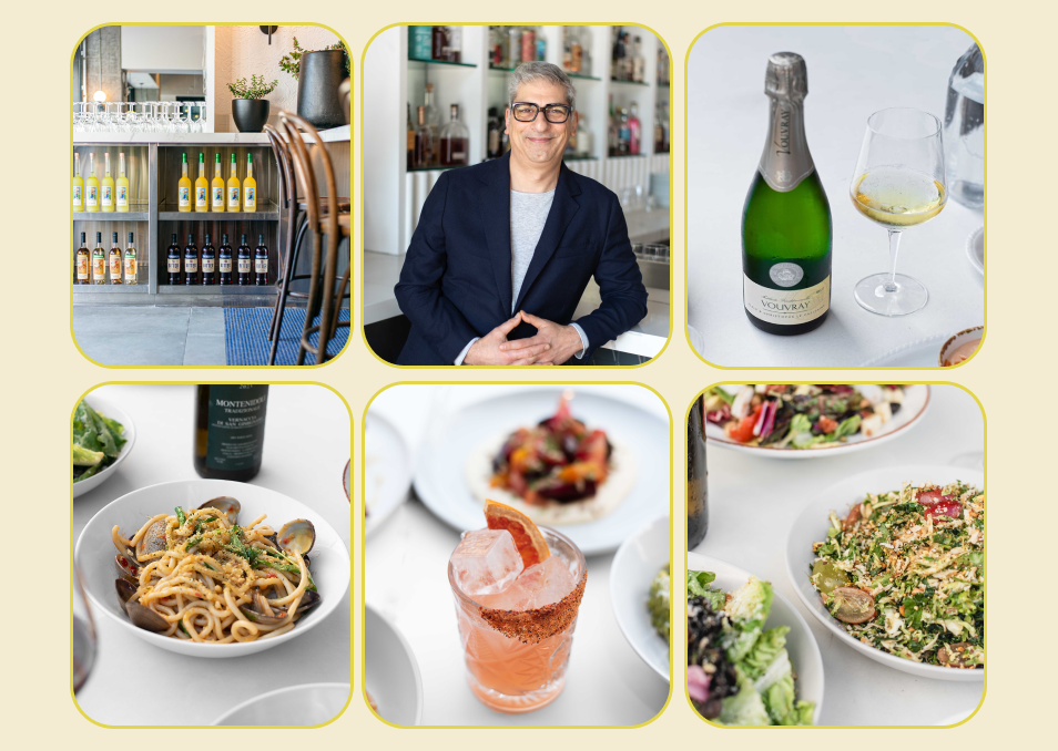
- Ensured images were consistent in style, editing, and aligned with brand guidelines
Images, Type, Color
Original
Redesign
The Process
03
User Interviews
24
Questions
03
Pain Points
Next, we needed to better understand the user journey from “Let’s dine out tonight” to booking a reservation.
User Journey
Design
The next step was crafting an information architecture that minimized the number of pages and prioritized the most needed information.
Wireframes
Visual Language
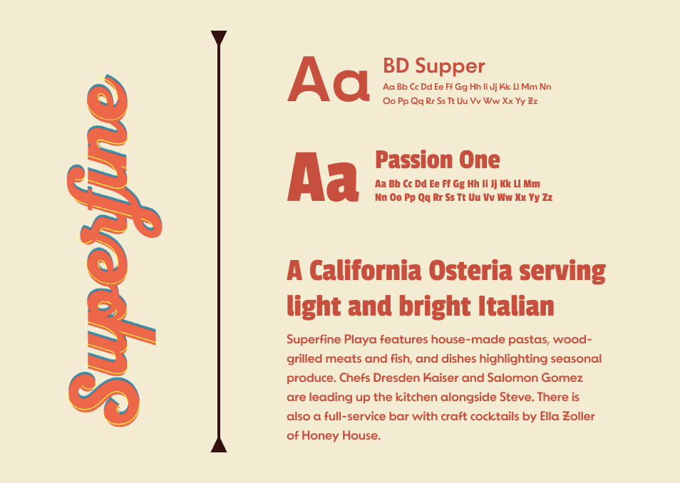
Superfine Playa had established brand guidelines to improve upon. The goal was to create a visual vibe that was warm, natural, casual, and classic.
Original Brand Guidelines
UI Inspiration
New Visual Identity
Next Steps
Test the final prototype with more users and make adjustments for improvement. Can help challenge the assumptions I made in my design.
01 Interactive Prototyping
Test the final prototype with more users and make adjustments for improvement. Can help challenge the assumptions I made in my design
02 User Testing
What I learned
This was the first project where I conducted 1:1 interviews. I had a lot of assumptions going in about what people were looking for and their preferences. After synthesizing the data, I had to take a step back from what I wanted or what I thought made a good mobile site and prioritize user needs.
I am not the user
Even if the information was easy to find and the site easy to navigate, a visual experience that was cohesive and exciting could ruin the user experience.


